Interior Design Newsletter Template
By Emailgic community
Summary
A design newsletter template for interior, architecture, and home brands. It organizes one themed issue around a featured story, three supporting articles, an inspiration gallery, an optional metrics block, and a focused CTA.
Best for
- Interior design studios publishing project insights or material notes
- Architecture practices sharing research
- completed spaces
- and studio news
- Home décor and furniture brands with an editorial journal
- Design publications curating several stories into one email issue
- Creative studios that need a visual
- portfolio-adjacent newsletter
Key takeaways
- Build each issue around one clear theme so the feature
- supporting stories
- and gallery feel connected.
- Give the featured story the largest image and most copy
- then keep secondary cards brief and scannable.
- Use the three-card row for distinct but related ideas
- such as furniture
- materials
- and art.
- Replace the sample metrics with verified
- clearly defined figures or remove the block entirely.
- Keep one primary CTA near the end and name the destination precisely
- such as “Read the Journal” or “View the Project.”
- Replace every placeholder link
- image
- address
- unsubscribe value
- and preference value before export.
- Review responsive behavior
- accessibility
- legal content
- tracking
- and ESP variables before sending.
Use cases
- Publish a monthly interior design digest with one lead article and three shorter recommendations
- Share an architecture studio update covering a featured project
- research notes
- and recent work
- Turn several home and living articles into a structured editorial email
- Introduce a seasonal furniture collection through stories
- materials
- and an inspiration board
- Send a portfolio-adjacent newsletter that directs readers to a journal or project archive
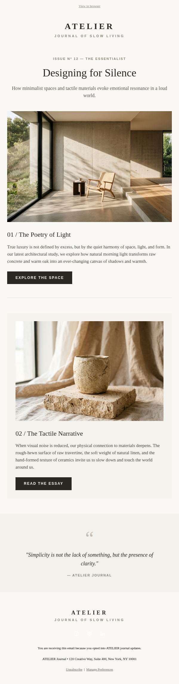
This design newsletter template is an issue-led editorial email for interior studios, architecture practices, home brands, and design publications. The supplied example centers Issue No. 14 on spatial balance, using a lead story about warm modern interiors, three short design notes, an inspiration gallery, and a closing CTA. It works best when a brand has several related pieces of content but still wants one story to lead the issue.
The layout begins with a restrained masthead and simple navigation, followed by a framed introduction that states the issue number, theme, and editorial premise. A full-width image and headline establish the featured story. Three compact cards then cover supporting subjects such as accent seating, ceramics, and structural art. An image-led gallery changes the pace before the dark metrics block and final CTA. Social links, company details, unsubscribe controls, and preference controls complete the footer.
To adapt the structure, choose one theme and assign every content block a role. Use the feature for the article or project that deserves the most context. Reserve the three-card row for shorter ideas that readers can understand independently. The gallery can present a mood board, material palette, product edit, or project detail. Keep card copy concise, use descriptive image text, and make the CTA label identify what readers will find after clicking.
The metrics area needs particular care. Its 94%, 3.5x, and 15k+ values are placeholders, not documented results. Replace them only with figures your organization can verify and define. For example, a studio might use the number of completed projects or years in practice if those facts are current and relevant. Remove the block when trustworthy figures are unavailable; decorative statistics weaken credibility.
Forest green, cognac, off-white, and linen tones give the email a warm editorial palette. Serif headlines distinguish stories from the system-font body copy, while uppercase labels clarify content roles. Preserve the hierarchy when applying a different brand system: one dominant feature, smaller supporting items, consistent spacing, and a single primary action matter more than retaining the sample colors.
Emailgic can turn a campaign brief into a responsive HTML email with subject-line direction, preview text, copy structure, and visual hierarchy. Review and edit the generated asset before downloading HTML or exporting a campaign setup package. The Mailchimp label indicates intended workflow or export fit, not automatic publishing or official affiliation. After export, configure links, tracking, variables, dynamic data, and account-specific settings in the destination ESP, then complete brand, accessibility, legal, and rendering checks before sending.