Spring Newsletter Template for an SPF Product Launch
By Emailgic community
Summary
This spring newsletter template shows beauty and skincare marketers how to introduce an SPF range with a photography-led hero, a four-card product-and-routine grid, repeated collection CTAs, a separate claims strip, and a compliance footer. Use it when one seasonal story needs to connect hero products with texture and routine education.
Best For
- Skincare and sun-care brands introducing a spring collection with a small number of hero products
- Beauty ecommerce teams combining product promotion with texture and routine education
- Marketers aligning seasonal inbox copy
- hero messaging
- and collection CTAs
- Founders looking for a photography-led product newsletter structure
- Teams preparing an approved brief for a responsive HTML email
Key Takeaways
- Carry one seasonal promise through the subject line
- preview text
- and hero headline.
- Place important hero copy on a contrasting panel when lifestyle photography has varied tones.
- Assign each grid card one clear role
- such as product introduction
- formula benefit
- or routine guidance.
- Repeat the collection CTA after readers have received enough product context to act.
- Separate claim labels for easier review
- but publish them only after substantiation and legal approval.
- Check image descriptions
- contrast
- destination links
- address details
- unsubscribe and preference links
- and rendering in the campaign’s priority clients.
Use Cases
- Announce a spring SPF or sun-care collection
- Refresh an evergreen skincare range for seasonal demand
- Feature two hero products alongside formula and routine guidance
- Compare CTA placement before and after supporting product information
- Turn an approved visual structure into an Emailgic campaign brief
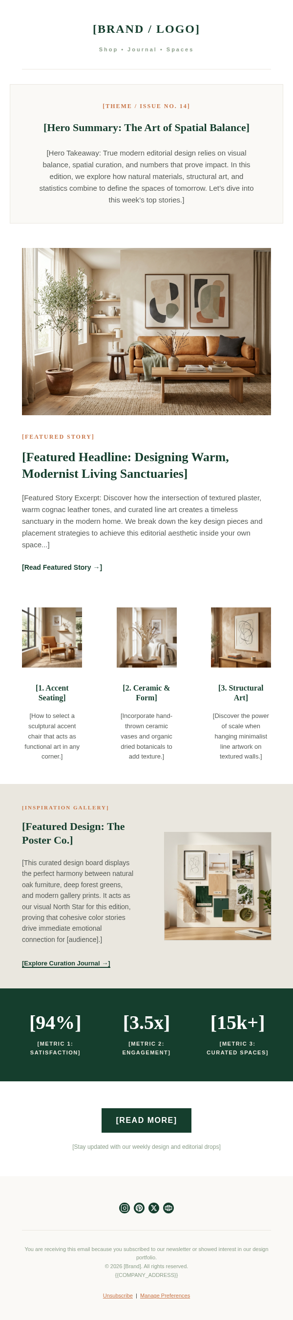
This spring newsletter template is an individual beauty email example for introducing a seasonal SPF range. The subject line, “Spring, Protected. Discover our new Solvra essentials,” establishes the campaign theme before the email opens. Its preview text extends that idea into a spring routine refresh, keeping the inbox message and hero focused on the same promise.
The design begins with a small left-aligned logo above a full-width lifestyle hero. A large serif headline anchors the image, while a translucent cream panel contains the introduction and first collection CTA. The panel gives the copy a stable reading surface over the photography, and the orange button stands apart from the sand and cream palette.
Two paired rows form a four-card product-and-routine grid. Mineral SPF 50 and Invisible Face Mist read as named products; The Perfect Texture and Daily Essentials shift the story toward formula feel and everyday use. That distinction makes the layout useful for a collection built around two hero items rather than forcing every card to behave like a product listing. A full-width lifestyle image then resets the pace before a bordered benefit block and second shopping CTA. The dark strip below groups four sample claim labels away from the main sales copy.
When adapting the structure, replace every name, image, description, CTA destination, and social link with approved brand material. Give each card a different job and keep its supporting line short. Treat all sunscreen benefits and the broad-spectrum, water-resistance, vegan, and testing labels as unverified sample creative that requires substantiation and legal review. Before launch, add descriptive image text, verify contrast, test every link, confirm the physical address and preference controls, and review rendering in the email clients that matter to the campaign.
To create a campaign from this reference, give Emailgic a brief covering the seasonal message, card order, CTA destination, approved claims, and brand context. Emailgic can turn that brief into a responsive HTML email that you can review and edit before handoff, then download as HTML or export as a campaign setup package. Configure account-specific links, variables, catalog data, segments, and triggers in the destination ESP, and complete brand, legal, accessibility, rendering, and ESP QA before scheduling or activation.