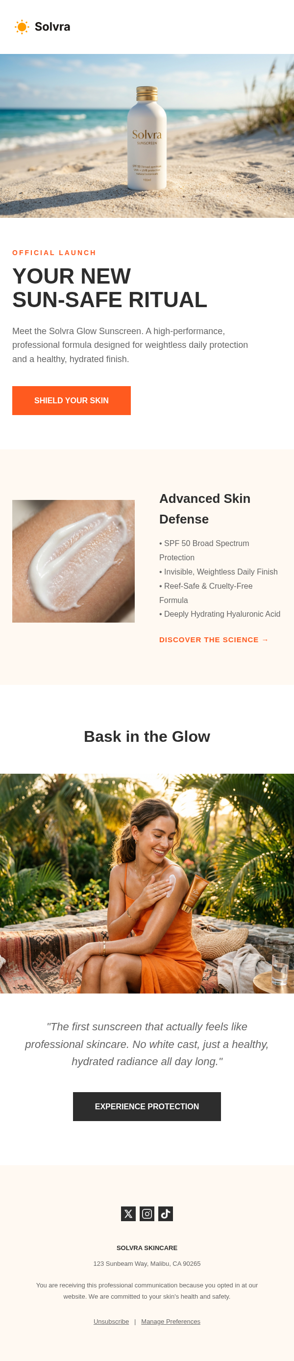
New Product Launch Email Template
By Emailgic community
Summary
A new product launch email template with a clear announcement sequence: introduce the release, explain three benefits, show key details, add verified proof, and direct readers to one next step.
Best for
- DTC brands announcing a new physical product to subscribers or waitlist members
- SaaS teams introducing a substantial feature to existing users
- Startups revealing a first release to beta applicants or early-access subscribers
- Consumer technology brands that need room for product imagery and feature details
- Design-led brands seeking a restrained launch email with one primary CTA
Key takeaways
- State the product
- intended user
- and problem in the opening instead of relying on a vague future-focused claim.
- Use the three benefit blocks for distinct customer outcomes
- then reserve the numbered section for supporting product details.
- Replace the sample rating and beta-tester quote with approved
- traceable proof; remove the block if credible proof is unavailable.
- Choose a CTA that names the real next step
- such as “View the Product
- ” “Join Early Access
- ” or “Start the Trial.”
- Treat Klaviyo as an export or workflow fit: configure variables
- links
- segments
- triggers
- and testing inside the destination account.
- Complete accessibility
- legal
- rendering
- link
- and ESP QA before scheduling or activating the campaign.
Use cases
- Reveal a new device or consumer product and link to its product page
- Announce a major software feature with benefits for a defined user segment
- Invite a waitlist to join an early-access or preorder program
- Introduce a new collection to existing customers without leading with a discount
- Adapt the proof block for a sourced customer quote
- verified review
- or approved press mention
This new product launch email template is a single announcement for brands introducing a physical product or major feature. It gives marketers a concrete answer to what a launch email can include: a direct introduction, three benefit summaries, supporting product details, a proof block, and one primary action. It is best suited to subscribers, customers, waitlist members, or users who already have some context about the brand.
The message begins with the subject-line pattern “Introducing [new product/feature] by [brand]” and preview text that identifies the product category and target user. Inside the email, a small launch label leads into a serif headline, short positioning statement, and product image. Three benefit blocks provide a quick overview before a numbered section gives each key feature more room. A testimonial placeholder follows, then a single CTA and a footer containing social, address, unsubscribe, and preference elements.
Visually, the template combines white and warm cream backgrounds with near-black text, muted supporting copy, Georgia headlines, and Helvetica-style body type. Centered introductory content gives the product image a clear role, while the benefits and detail sections create two levels of explanation for readers who want different amounts of information. The restrained palette can suit design-led products, but every brand should replace the colors, type choices, images, and wording when they conflict with its own identity.
Start customization by replacing every bracketed field with specific, supportable information. Write each benefit around a different user outcome and use the numbered section for the product details that explain those outcomes. Add descriptive image text, confirm that the CTA points to the correct product, trial, preorder, or access page, and use urgency only when a real deadline or availability limit exists. The sample five-star rating and beta-tester quotation are placeholders, not evidence. Replace them with an approved customer statement, verified review, or sourced press mention, or remove the proof block entirely.
Emailgic can turn a campaign brief into a responsive HTML email, provide subject-line and preview-text direction, and let users review and edit the generated asset before export. If this template is prepared for Klaviyo or another ESP, the exported asset still needs final account setup. Connect the correct variables, links, segments, catalog content, and triggers in the destination platform, then check brand, legal, accessibility, rendering, and tracking details before activation.
For testing, compare meaningful choices rather than cosmetic variations alone. A subject line centered on the product name can be tested against one centered on the audience outcome. The CTA can name the product page, early-access step, or trial action. Proof can also be tested against a shorter version without the block. Use this showcase as a structural reference, then adapt it in Emailgic and export the responsive HTML for final ESP configuration and review.